
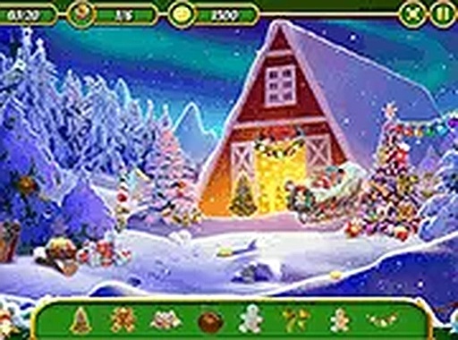
Visual Presentation & Atmosphere
The game features illustrations that capture the essence of a quiet winter setting. Each scene includes elements like decorated trees, soft lighting, and wrapped boxes. The artwork is designed to be inviting without being cluttered, allowing players to focus on the search. The color palette uses cool blues and warm golds to create a balanced, pleasant mood. This visual style supports the game's goal of providing a relaxing yet focused activity.
Core Search Mechanics
Players receive a list of items to find at the start of each round. These objects are integrated into the scene, sometimes partially obscured by other elements. The challenge lies in distinguishing the target item from the surrounding details. Controls are straightforward: a simple click or tap on a found object registers the discovery. The interface provides clear feedback, confirming each successful find with a visual cue.
Progression & Difficulty Curve
The game advances through a series of scenes, each presenting a new arrangement of items to locate. Later stages introduce more objects or place them in trickier positions, requiring closer inspection. This gradual increase in complexity keeps the activity engaging without becoming frustrating. The timer adds a gentle sense of urgency, encouraging efficient scanning without demanding speed. Players can replay completed scenes to improve their time or simply enjoy the artwork again.
Accessibility & Platform Support
Designed for broad accessibility, the game runs directly in web browsers on both desktop computers and mobile devices. No installation or download is required. The interface adapts to different screen sizes, ensuring a consistent experience whether using a mouse or a touchscreen. This flexibility makes it easy to play during short breaks or longer sessions. The simple control scheme means that players of all ages and technical skill levels can participate without a learning curve.






Comments
0 comments